sweeten
Enhanced Sweeten.com’s UX by improving onboarding, navigation, and conversion flows, resulting in a more intuitive and user-friendly experience.
00

problem
Sweeten.com, a platform designed to connect homeowners with vetted contractors for renovation projects, faced challenges in delivering a seamless and confidence-driven user experience. Users often felt overwhelmed when starting their renovation journey due to unclear navigation, lack of structured guidance, and complex onboarding flows. Key actions such as posting a project, understanding the process, and selecting the right contractor required multiple steps and lacked clarity, leading to drop-offs and reduced engagement. Additionally, the platform did not effectively build trust through its interface, which is critical in high-investment decisions like home renovation. The absence of a clear information hierarchy and inconsistent UI patterns further increased cognitive load, making it difficult for users to move forward confidently.
solution
To address these challenges, I redesigned the platform using a user-centered approach focused on simplifying the user journey and building trust. I restructured the information architecture to create a clear and intuitive flow, guiding users step-by-step from project discovery to contractor matching. The onboarding experience was streamlined by reducing unnecessary steps, simplifying forms, and introducing clear instructions and progress indicators. I improved the visual hierarchy across key pages, making content easier to scan and actions more prominent. Trust-building elements such as testimonials, project examples, and clear process explanations were strategically integrated to support user decision-making. Additionally, I developed a consistent design system to ensure uniform UI patterns and improved responsiveness across devices. High-fidelity prototypes were created in Figma and refined through iterative feedback, resulting in a more intuitive, engaging, and conversion-focused experience.
When I first explored Sweeten.com, it was clear that the platform had a strong concept but lacked clarity in execution. The idea of connecting homeowners with trusted contractors is powerful—but the experience didn’t fully support users in making such an important decision.
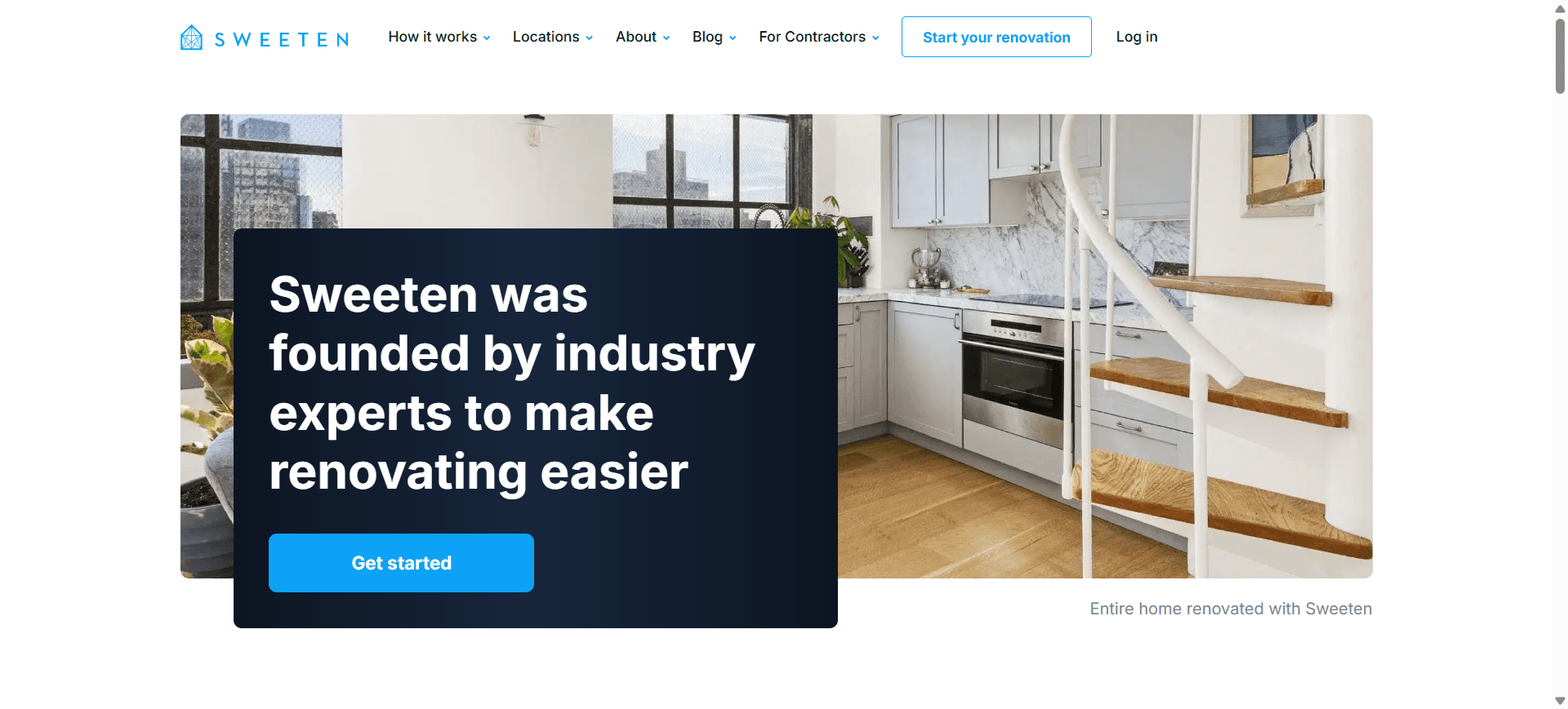
During research, I noticed that users weren’t just confused—they were hesitant. Starting a renovation project is a big commitment, and the platform wasn’t doing enough to guide or reassure them. One user mentioned they weren’t sure what would happen after submitting a project, which led to hesitation and drop-off.
That insight changed my perspective. This wasn’t just a usability issue—it was a trust and guidance problem.
I began by simplifying the journey. Instead of overwhelming users with too many options, I created a structured, step-by-step flow that clearly explained what happens at each stage. The onboarding process was redesigned to feel lighter and more supportive, with fewer fields, better instructions, and visible progress.
Next, I focused on building confidence. I introduced elements like real project examples, testimonials, and clearer explanations of how Sweeten works. The goal was to make users feel informed and reassured before making decisions.
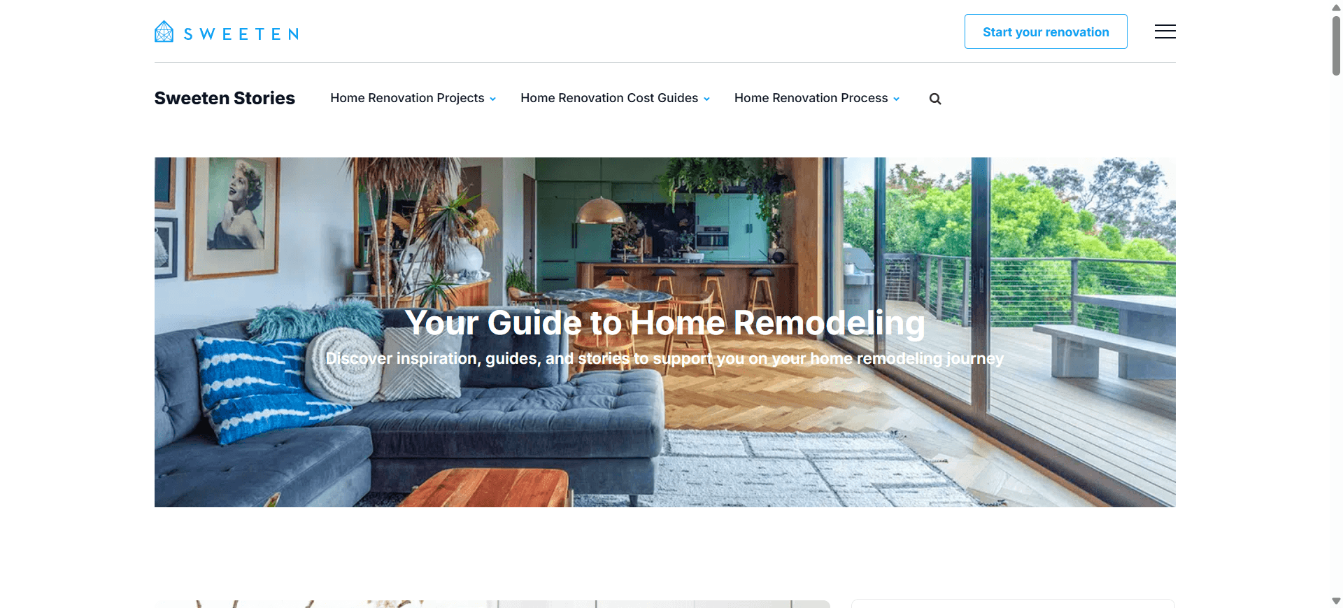
I also improved the overall layout and navigation, ensuring that users could easily find what they needed without confusion. A consistent design system helped bring everything together, making the experience feel more polished and reliable.
year
2021-22
timeframe
2 year
tools
Sketch, Invision, HTML, CSS, Bootstrap, wordpress
category
UI/UX
01

02

03
see also


