Landrover Jaguar
Designed an intuitive dashboard for Land Rover Jaguar, improving data visualization, navigation, and user efficiency through a user-centered UX approach.
00

problem
The existing dashboard system for Land Rover Jaguar was not effectively supporting users in managing and analyzing complex automotive and operational data. The platform presented large volumes of information without a clear structure, making it difficult for users to quickly interpret insights and take timely actions. Navigation was inconsistent and unintuitive, causing users to spend excessive time locating key features and data points. Additionally, the lack of a defined information hierarchy and standardized UI components led to confusion and increased cognitive load. Critical workflows, such as data analysis and reporting, were fragmented and required multiple manual steps, reducing overall efficiency. The system also lacked effective data visualization, limiting users’ ability to identify patterns, trends, and performance metrics at a glance. These challenges resulted in slower decision-making, reduced productivity, and a suboptimal user experience.
solution
To address these challenges, I redesigned the Land Rover Jaguar dashboard using a user-centered approach focused on clarity, efficiency, and scalability. I restructured the information architecture to organize complex data into logical groups and introduced intuitive navigation patterns, enabling users to access key information quickly. The dashboard was redesigned with a strong visual hierarchy, incorporating clear data visualizations such as charts, filters, and structured tables to simplify analysis and highlight critical insights. I streamlined core workflows by reducing unnecessary steps and introducing smart interactions, improving overall task efficiency. Additionally, I developed a consistent design system with reusable components to ensure uniformity across the platform. Through iterative prototyping in Figma and continuous collaboration with stakeholders and developers, the final solution significantly enhanced usability, reduced cognitive load, and enabled faster, data-driven decision-making.
The Land Rover Jaguar dashboard project started with a system that was powerful in terms of data, but difficult to use in practice. When I first explored it, I noticed that while a lot of information was available, it wasn’t organized in a way that helped users make quick decisions. During discussions with stakeholders and users, a clear pattern emerged—people were spending too much time navigating and interpreting data instead of actually using it.
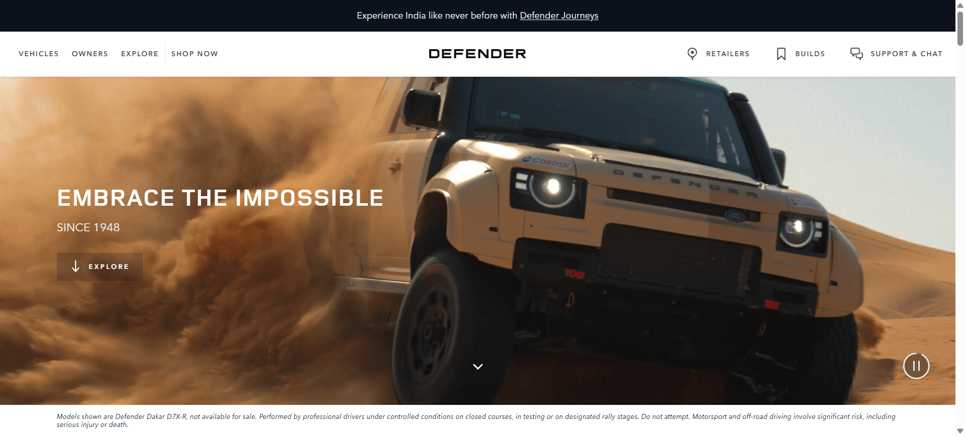
One particular session stood out. A user walked me through how they analyzed vehicle-related data and generated reports. They had to jump between multiple sections, apply filters repeatedly, and manually piece together insights. It was not only time-consuming but also increased the chances of errors. That moment made it clear that the core issue wasn’t the lack of data, but how it was structured and presented.
I started by rethinking the foundation of the dashboard. I reorganized the information architecture to group related data logically and introduced a more intuitive navigation system. The goal was to make the experience feel predictable, so users always knew where to go next. Then I focused on simplifying complexity—designing cleaner layouts, improving table structures, and adding meaningful data visualizations that made trends and insights easier to understand at a glance.
I also streamlined key workflows by reducing unnecessary steps and introducing smarter interactions, so users could complete tasks faster and with less effort. Alongside this, I built a consistent design system to ensure uniformity across all screens, which helped reduce confusion and improved overall usability.
After several iterations and feedback sessions, the transformation was clear. Users were able to find information quickly, analyze data more efficiently, and complete tasks with greater confidence. What was once a complex and fragmented system evolved into a streamlined, intuitive dashboard that truly supported users in making faster and more informed decisions.
year
2022
timeframe
9 month
tools
figma
category
UI/UX
01

02

03
see also


